All projects

Selfwealth Redesign

Client
Selfwealth
Category
Application
DURATION
1 months
YEAR
2022

The challenge

Selfwealth's app has many usability and design issues. The app itself is confusing to navigate and has an unclear design language.

The goal

View the live site

User Research

Read more
View the full case study
PROCESS –
PROCESS –
PROCESS –
PROCESS –

the process

After conducting the market research I found there to be two major issues that needed to be solved. Firstly, the lack of branding identity and design language and lastly, the overcomplicated visual elements making the experience confusing for the users.

Read more
View the full case study
No items found.

Conclusion

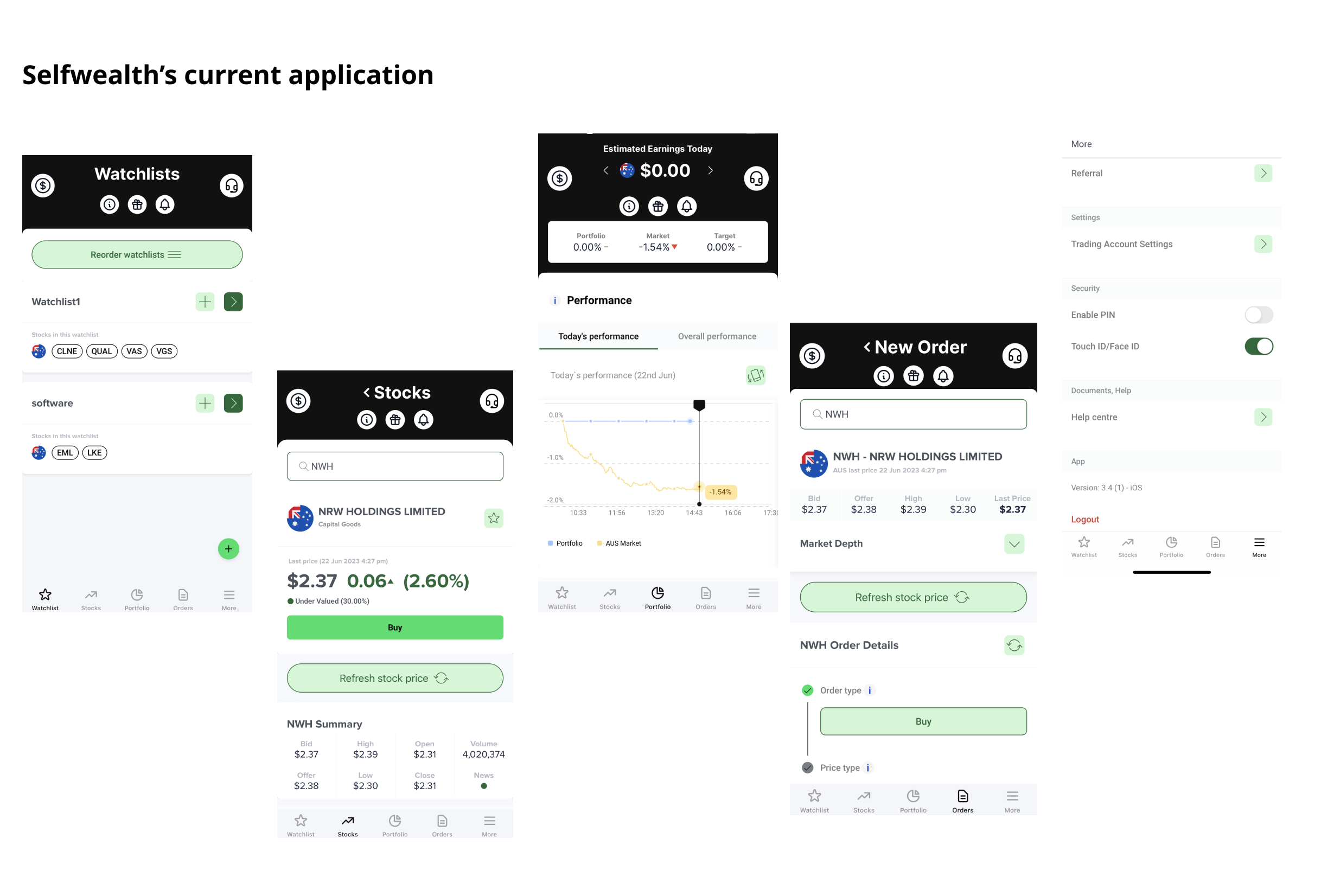
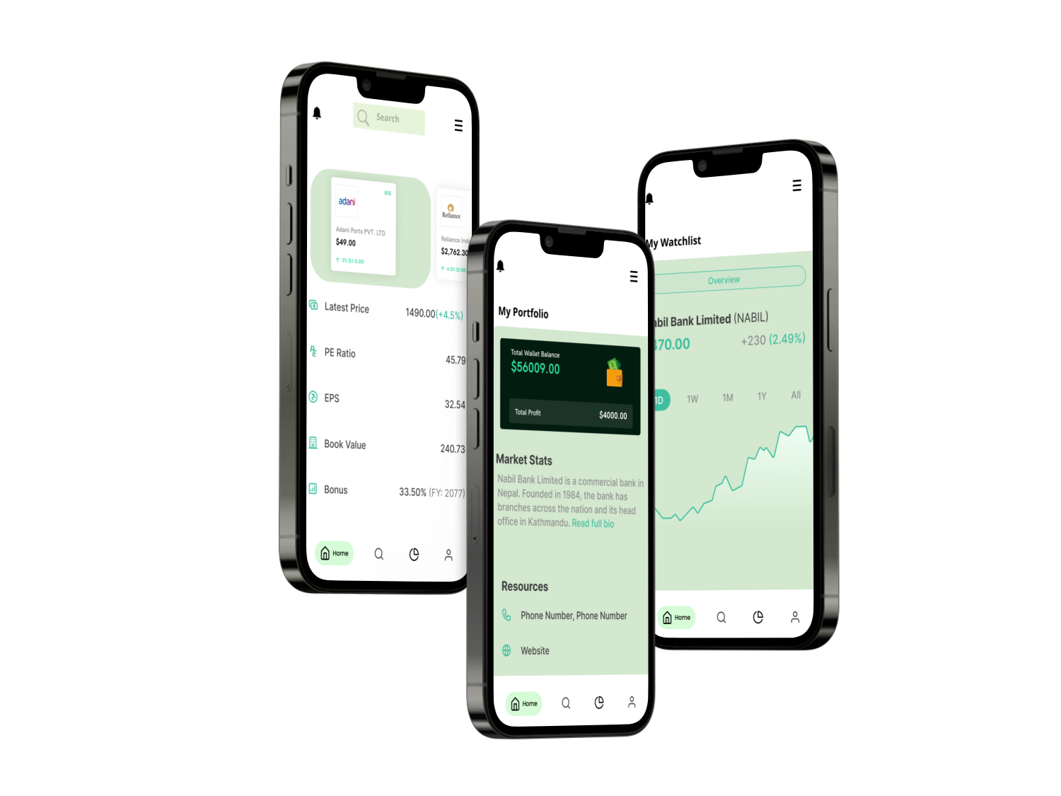
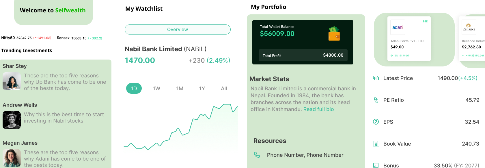
The new redesign focused on design consistency, introducing the green logo colour into the app allowed for a clear visual brand identity. Stock and investment apps tend to be too heavy with information so narrowing down the navigation bar from five to four introduced simplicity. I also added clear icons to guide users into each stage and got rid of the ones that were not needed. Overall the design was simple and clear, if given more time I would have like to designed the app in more depth going in to added shadows over elements and customising the logo.

Read the full case study
View the live site
DRAG